Company
Bulb
Position
Lead designer
Leading brand direction and interaction principles for a full app rebuild
Led visual and interaction design across a team of 4 designers, 3 products, and 3 different platforms

As Bulb grew beyond energy supply into smart meters, EV charging, solar, and battery products, its original digital experience no longer reflected the brand or met user needs. The app was built for simplicity, but not for scale.
Limited room to grow
The old structure didn't support growing product needs, making new products hard to find and limiting user engagement.
Key info, hard to find
Billing, usage, and account details were hidden, frustrating users.
Inconsistent Platforms
Web and native apps offered different experiences, confusing users and doubling effort.
Equally, the product didn’t feel like Bulb. The warmth, optimism, and personality of the brand—brought to life through illustration, tone of voice, and visual storytelling—was missing from the UI. This was a missed opportunity to build trust, delight users, and make Bulb truly stand out in a crowded energy market.
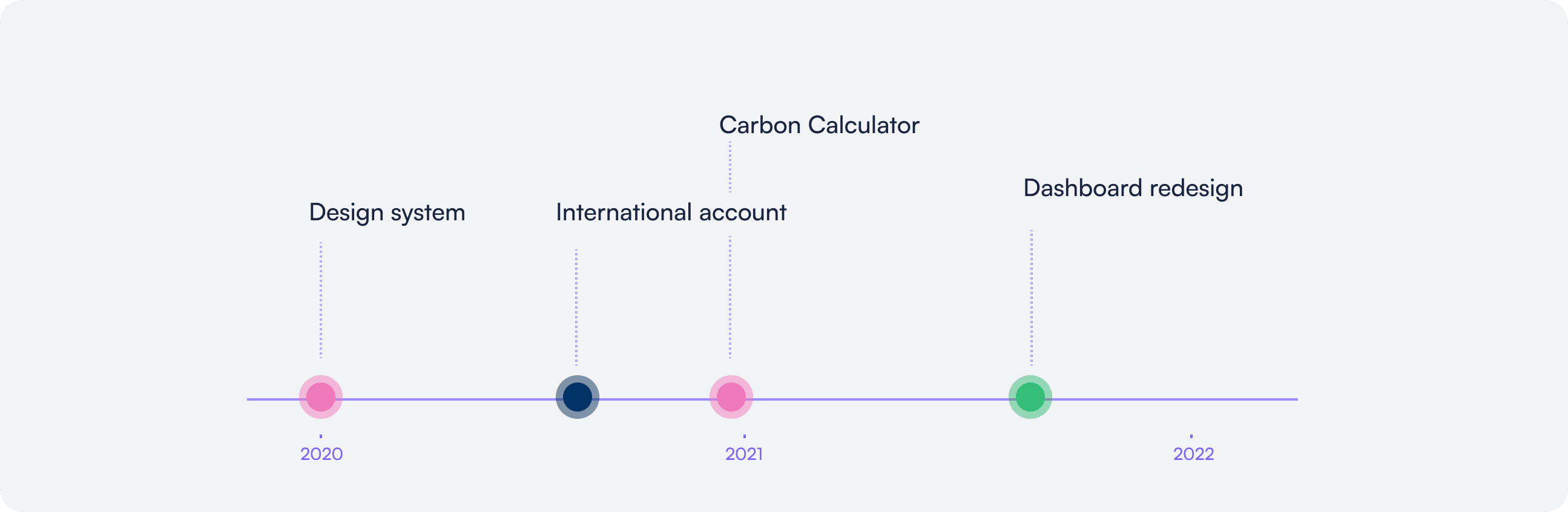
We secured business buy-in through a phased approach.
I began by tackling issues within the design system—building an accessible, flexible, fast foundation that launched with Bulb’s international platform. This proved the value of the system and laid the groundwork for broader adoption.
I also set a new brand direction and tested principles on smaller projects like the Carbon Calculator, which received positive user feedback.
Together with the success of the international work, this helped green-light the main dashboard and account redesign.
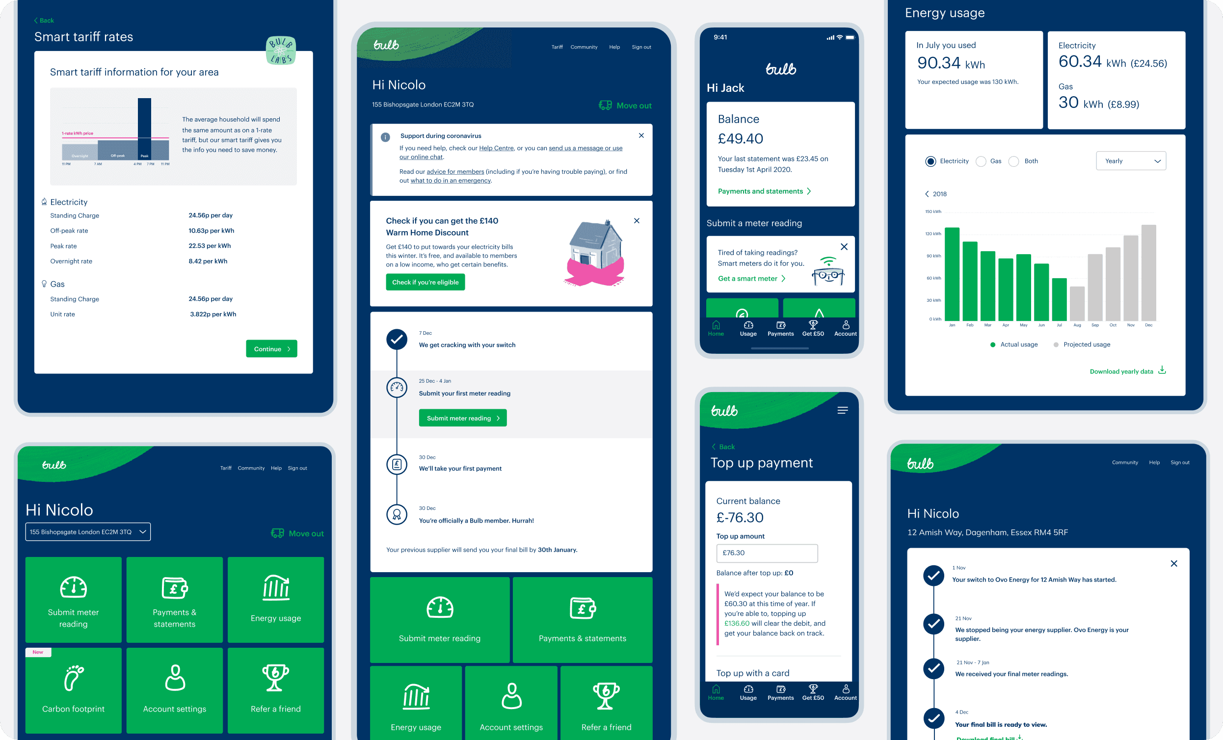
During the dashboard rebuild:
I led design direction across 3 products and 4 designers, ensuring consistency and working through implementation details as they arose. I developed design system guidelines that allowed products to scale within the old theme while preparing them for seamless migration to the new one. I worked closely with engineering leads to ensure the new system was feasible and easy to adopt.
This direction was adopted across teams with strong user feedback and faster dev cycles.
Direction

Direction
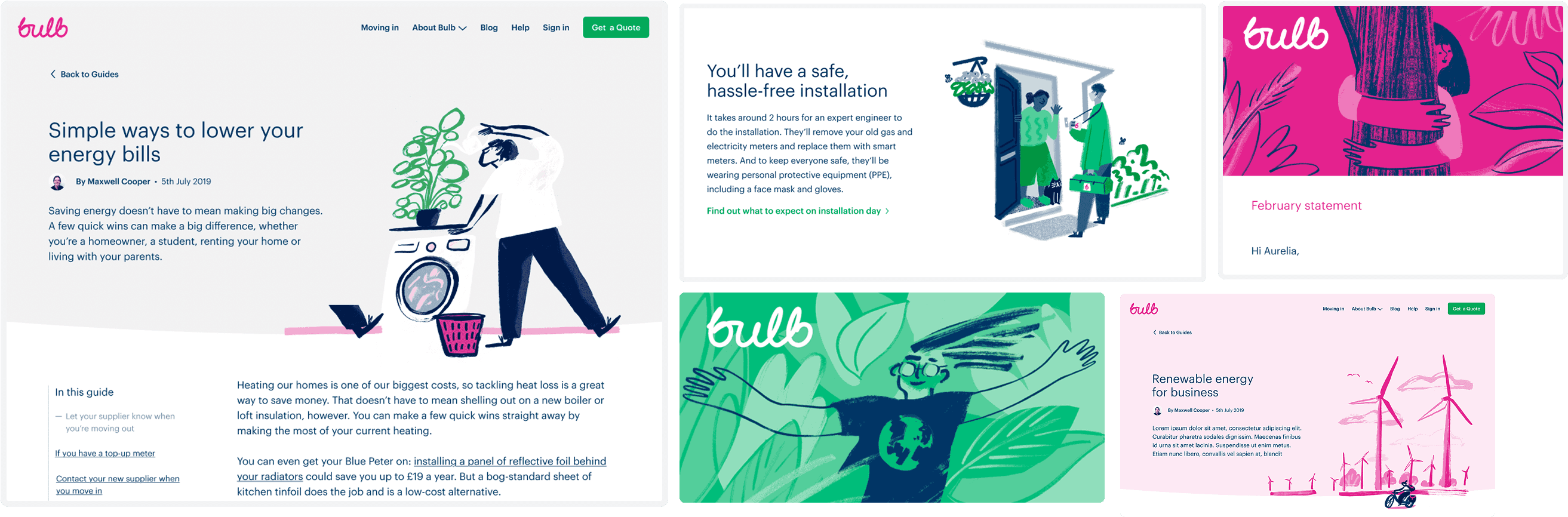
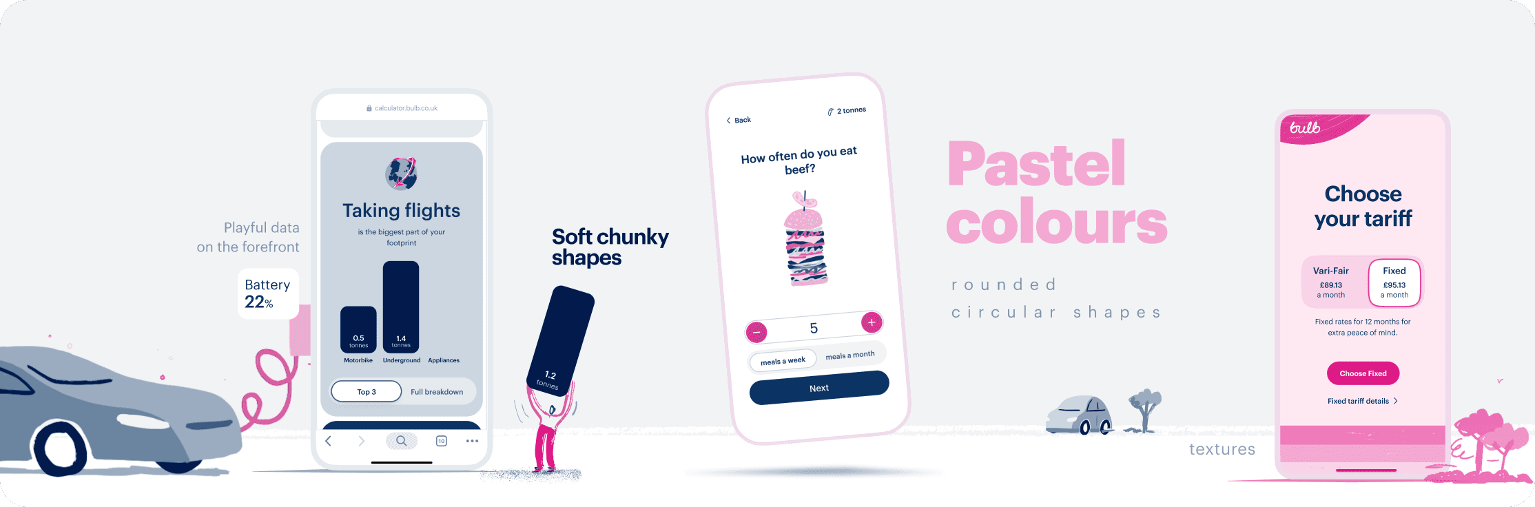
To define Bulb’s visual language, I leaned into its core traits: optimism, simplicity, and playfulness.
I introduced light pastels and generous spacing to create a calm, approachable feel.
Bold shapes with large, rounded corners were applied across typography, data visuals, and UI controls—creating a look that felt both soft and confident.
By bringing illustrations and data to the forefront, the experience became more expressive and meaningful. The result was a product that felt vibrant and optimistic, yet clear and purposeful
Direction
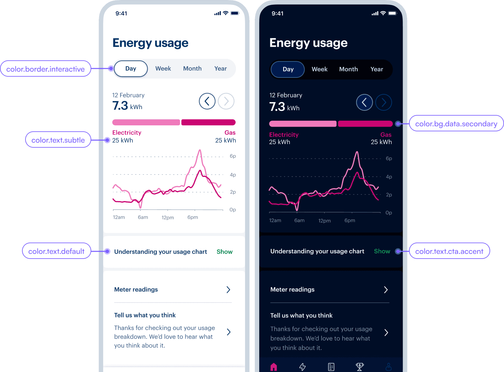
With the new design, I aimed to use more colour to highlight Bulb's personality. I made the colours functional by assigning specific meanings to them, bringing more structure and content hierarchy to each page.

The Carbon Calculator was essentially an interactive survey that asked users about their lifestyle choices, calculated their carbon footprint, and offered an option to offset it with a monthly fee.
I collaborated with an illustrator to design unique interactions that made the survey enjoyable and engaging.
I pushed the boundaries of playfulness, ensuring the experience was fun, both in how users provided their data and how the results were presented—aligning closely with Bulb's friendly and optimistic personality.

Carbon Calculator
The experience received a lot of overwhelmingly positive (78% positive) feedback, with many users sharing their results on social media.

After the success of Carbon Calculator I worked with 3 other designers from dashboard, payments and design system to bring the vision to life.
I developed a set of templates that often combined editorial-style illustrations with live data making them interactive and bringing Bulb’s essence to the center stage.
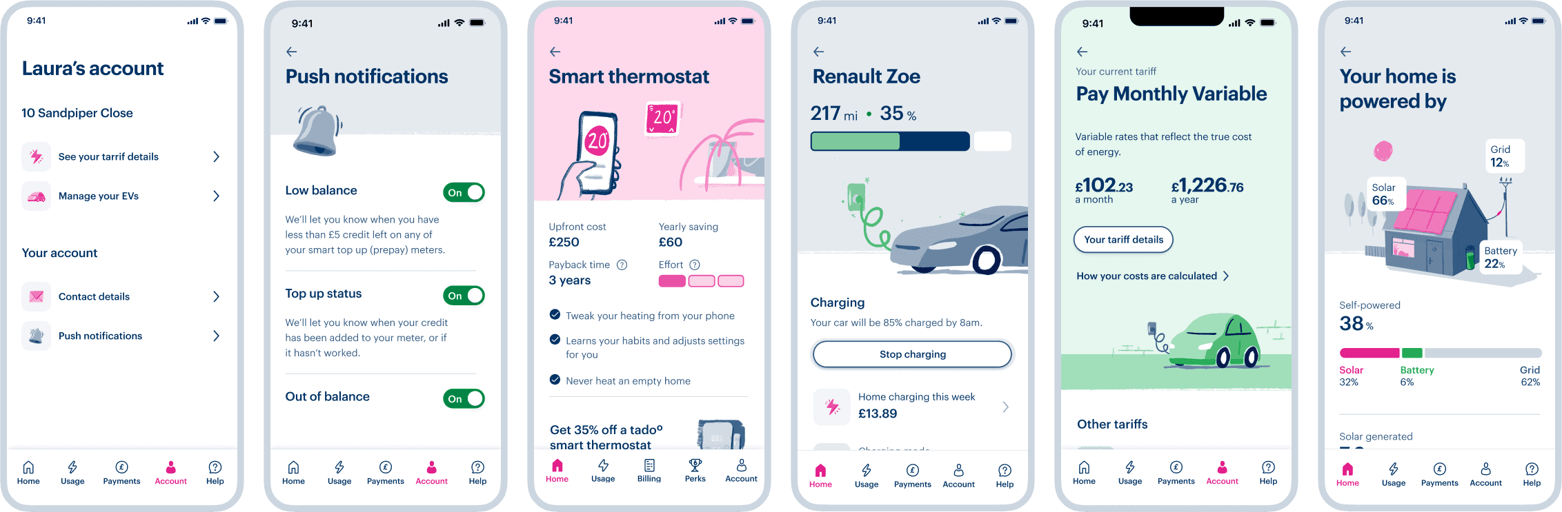
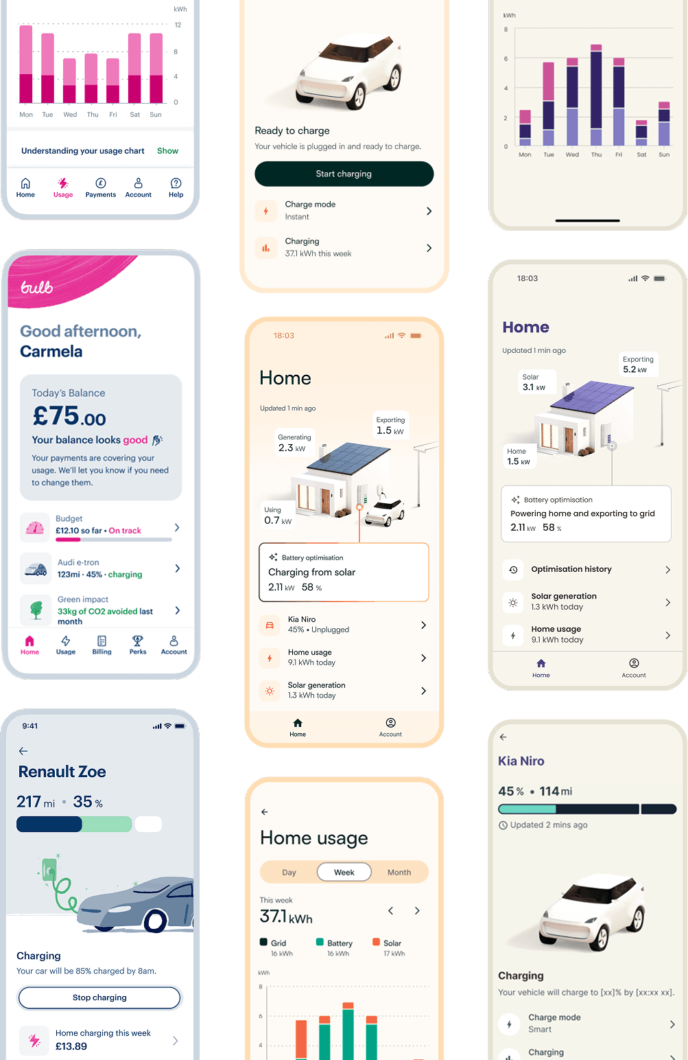
Dashboard rebuild
I designed dynamic widgets that gather key information from across the account, making it easy to track your balance, budget, EV status, and more, all from one place.
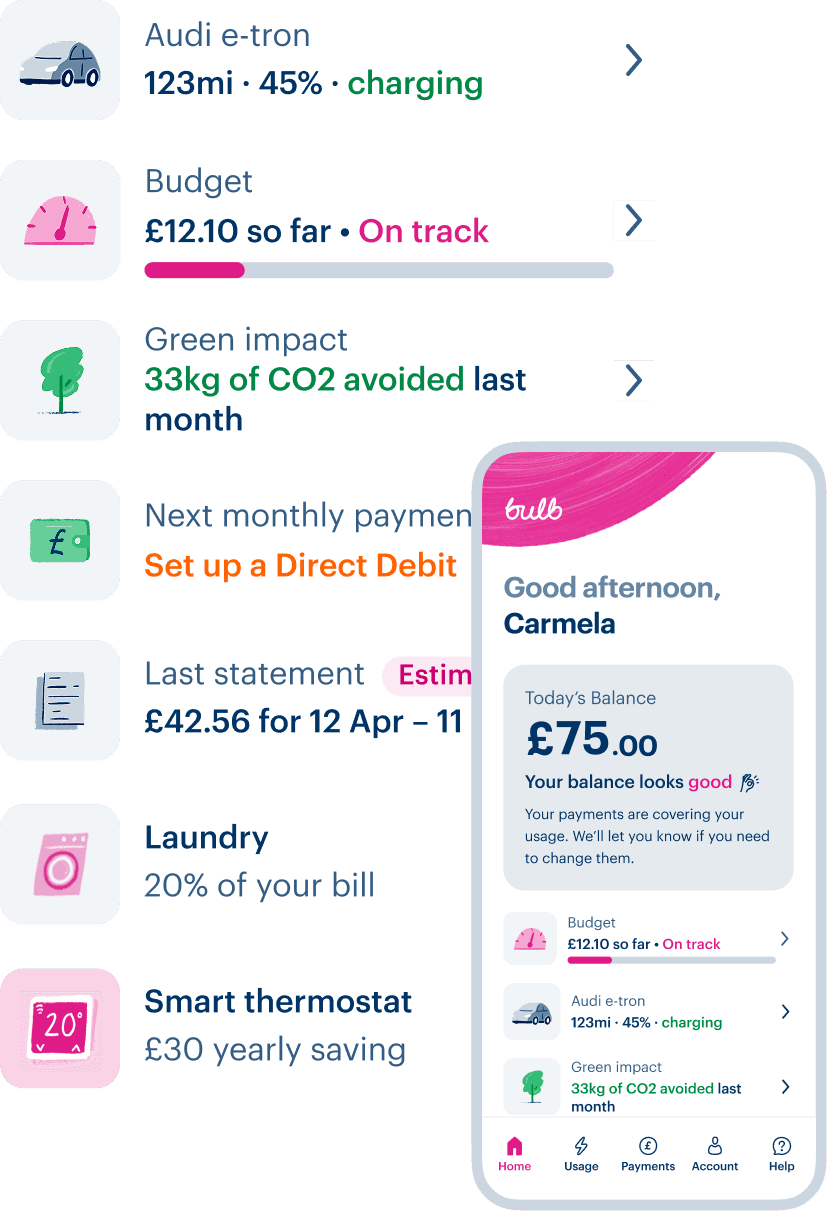
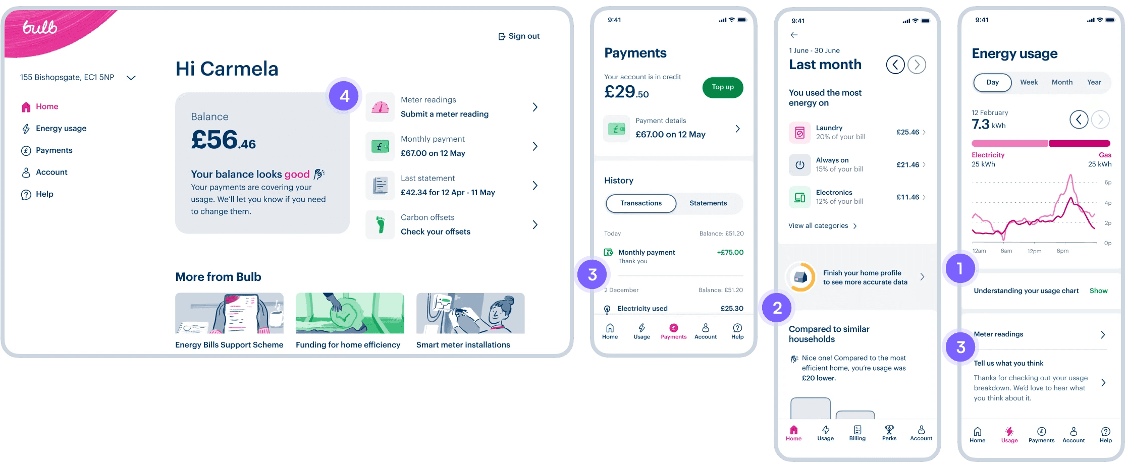
Bulb ecosystem
The clean, spacious layout was achieved by reducing content dividers to a minimum. I used:
1. full bleed blocks of content to create spacious environments, only briefly revealing the space in between, sometimes expanding the space to show
2. contextual banners
3. light divider lines to separate similar content and only in rare cases
4. coloured content containers to highlight main information

Bulb ecosystem


Direction
Although Bulb ceased to exist in 2023, design system and principles defined in this project continue to exist, powering Zoa, a white-label renewable energy platform built on Bulb's tech legacy.